Are feed, story and ad sizes the same frame?
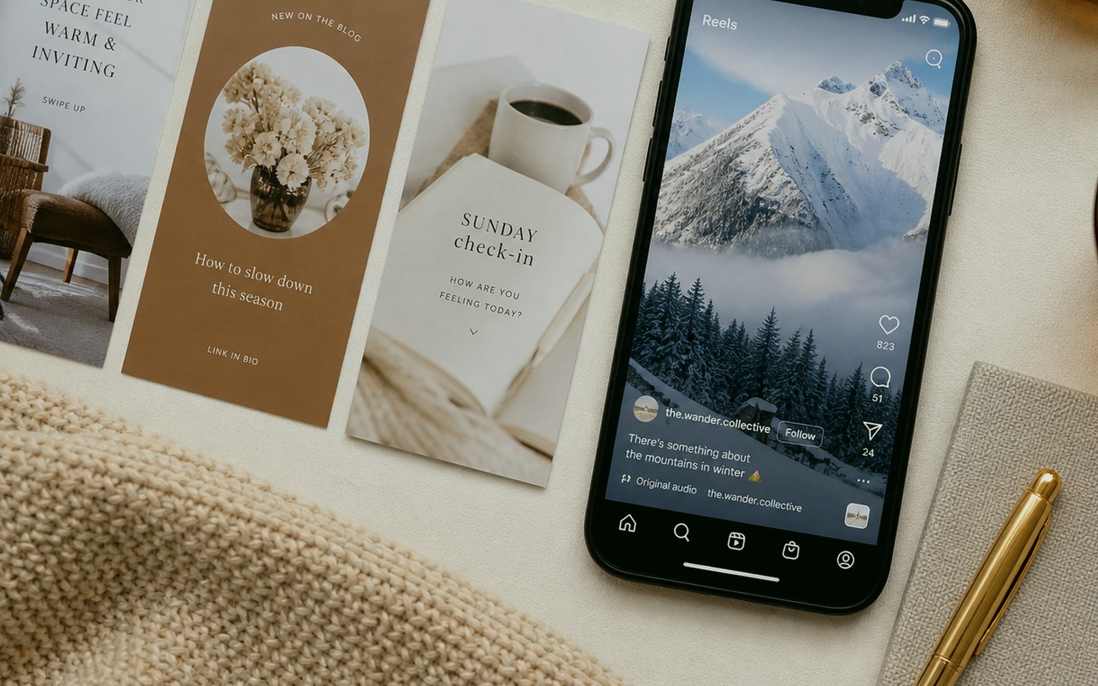
They are not. Story is vertical, feed square, Google Display horizontal, Meta 1.91:1 — each cuts face and logo differently. At Sergili Reklam an ad visual is not pasting an Instagram square into the ads account. Offer sentence first, then a crop board. Erzurum shopkeepers say “this frame should sit everywhere”; a frame that sits everywhere is read nowhere. A Palandöken hotel and a Yakutiye window do not shout in the same size. The file is born once, correctly, then derived by size. Derivation is not reinvention.
When safe zone is forgotten, the heading buries itself in the platform UI. Profile circle, “Sponsored” label, mute icon. We check those in a real ad preview, not only a mockup. For a remote brand the same check happens on a shared screen. Distance does not cancel crop. Ignoring crop is burying budget in the margin. The offer sentence sits in the first frame, not a novel inside the visual. The Ad Visuals quote also writes what we will not do; that line is identity too.
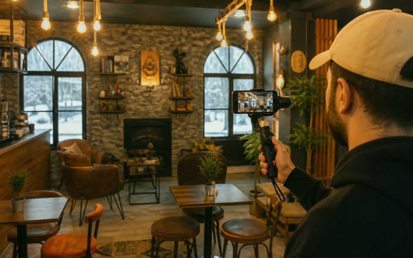
Motion and still should be siblings. Feed stands, story slides, the ad is read in the first frame. If motion shares the studio, tempo is shared; a separate “effects person” makes the promise late with 300ms. The first frame is the only chance on a silent, fast-opening phone. Chance sits in sentence and face, not in decorative confetti. A real counter weighs more than a stock mountain; stock is last resort and said so. Questions: 0549 641 69 69; shop Bosna Hersek Caddesi No:43, Erzurum.
Where does the offer sentence sit on a visual, and where does it vanish?
Sentence at the top, price clear, proof small; button copy is a separate job (on the landing). Writing a novel inside the visual breaks both design and ads policy. In Erzurum a fog of “affordable prices” is weaker than “survey free this week”. In Palandöken date and cancellation matter more than a mountain silhouette. On a visual abroad, language and currency lock before the photo. Without the lock, A/B tests two lies.
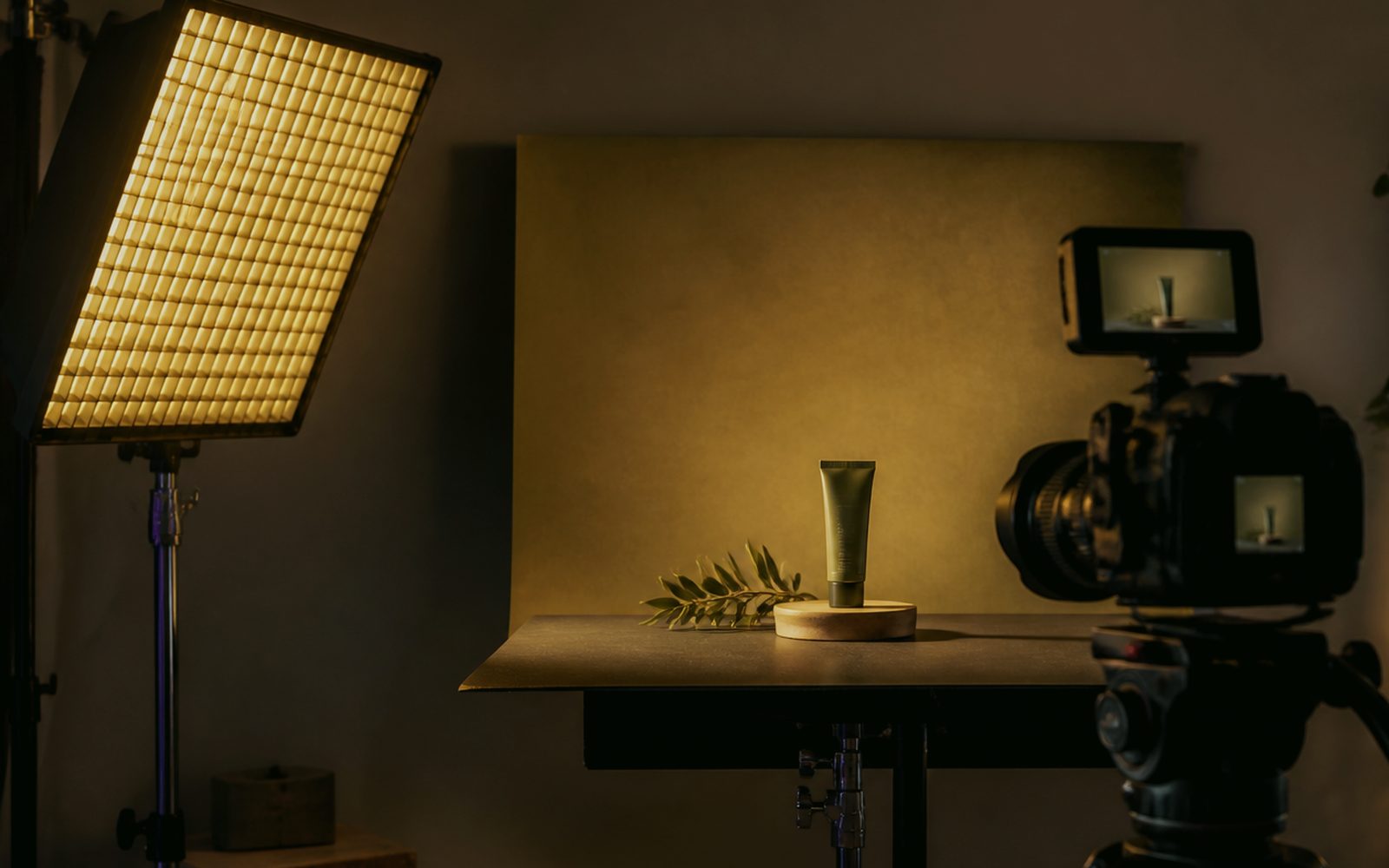
Face and product weigh more than a stock smile. A real counter, real winter glass, real channel letters. Stock mountains and stock pizza lose the clicker at the first objection. If the shoot shares the roof, light is set for the ad crop, not only the Reels square. For a remote client we mine the archive and list gaps. “Design” without a photo is a frame, not a sale. If the price on the landing fights the ad frame, trust ends. Revision rounds are written; there is no endless “let’s also try this”.
Legal copy and health/finance claims should not vanish in a footnote; type size sits on the handover list. Meta and Google text-ratio myths change; readability does not. A tiny grey footnote is a penalty. We make the footnote part of the design, not a last-minute shame. Safe zone in discovery prevents burying copy in platform UI. Climate is a calendar item, not an excuse. The source is born once, sizes derived; the same JPEG is not pasted everywhere. We do not invent references; process and handover speak.
Does Erzurum winter and street light lose to a stock mountain?
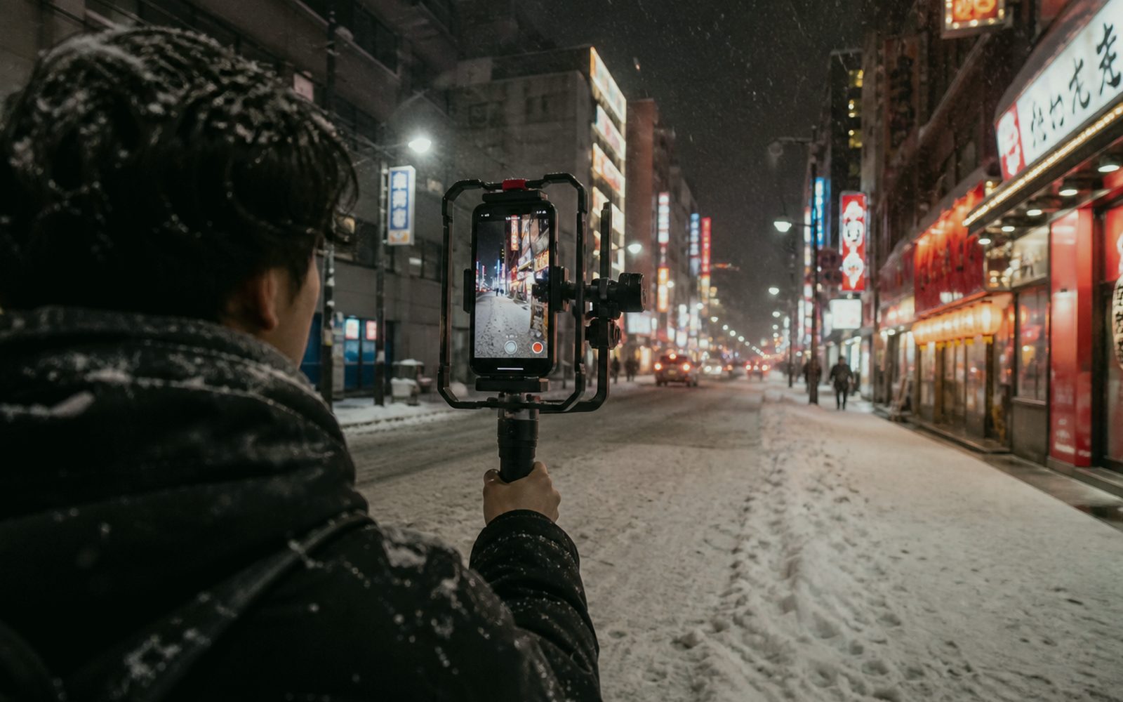
Stock mountains lose. Erzurum winter, street steam, Palandöken light, an Aziziye steel door — those are yours. Stock belongs to everyone. We want a real frame so ad budget does not flow to everyone’s property. Outdoor shoots can slide in winter; studio and an existing façade photo do not. Climate is written into the calendar. “Let’s just put stock” is a short road and a long distrust. The source is born once, sizes derived; the same JPEG is not pasted everywhere. Launch day is the middle of the job, not the end of applause.
Light shifts fascia red. Night LED, daytime sun, snow bounce. So the hex in the identity guide does not explode as raw RGB in the ad, profile is discussed. If production shares the roof, film and screen are siblings. If not, we still warn: a red that burns on screen can sit dull on the façade. The fight splits the budget in two. The offer sentence sits in the first frame, not a novel inside the visual. Ad Visuals is read with the same measure in Yakutiye, Palandöken and Aziziye; there is no neighbourhood discount.
Copying rival visuals is bidding against yourself in the auction. We shoot the gap: the neighbourhood they did not shoot, the price they did not answer, the team they did not show. Then your counter. We say no so the city is not one pile of stock. No is a friend of budget, not an enemy of creativity. A real counter weighs more than a stock mountain; stock is last resort and said so. Ad Visuals discovery keeps municipality, façade and winter on the same page.
Two visuals, two promises: what is A/B, what is decoration?
A/B is two proofs of the same promise, not two campaigns in disguise. Heading placement, face, price emphasis. Producing ten variants before the offer stands is dodging a decision. On an Erzurum SME budget two visuals are enough, not twenty slides. The hypothesis is written. If it fails we stop, not by drawing a new frame every day. A/B is two proofs of one promise, not twenty decorations. Questions: 0549 641 69 69; shop Bosna Hersek Caddesi No:43, Erzurum.
Ads-account policy also cuts A/B. Before-after, miracle, fake buttons. We plant forbidden patterns in discovery. When the account closes, the beauty of the visual does not help. The boring filter is the price of an open account. If the price on the landing fights the ad frame, trust ends. If the report must fit five lines, this line enters those five. Safe zone in discovery prevents burying copy in platform UI. The neighbour sees the street; a lying promise does not last.
Landing and visual come from the same offer sheet. A red price in the ad and none on the page ends trust. That is cousin to the landing line, a cousin that should be born at the same table. Separate agencies kill that cousin in an email chain. One counterpart, one revision. Safe zone in discovery prevents burying copy in platform UI. Revision rounds are written; there is no endless “let’s also try this”.
- Crop board: story, feed, ads, banner are not born as one
- Offer sentence in the first frame; no novel inside the visual
- Real counter and winter light weigh more than stock mountains
- A/B is two proofs of one promise, not twenty decorations
- Landing and red come from the same offer sheet
Does brand red shout in an ad, or does it stand?
Shouting red cheapens the brand; vanishing red erases it. If a guide exists we bind to it. If not, the campaign palette is locked with a short card so a new orange is not born in every ad. In Erzurum we take production and pixels into the same dictionary so street fascia and ad frame are relatives. If you do not want that, digital frames only. We do not force it.
Type is licensed. A “free fancy font” in an ad square can be both illegal and unreadable. Turkish glyphs (ş, ğ, ı) must not break. In an English campaign the sentence shortens and the layout carries it. We draw that from the start, not on launch morning. The offer sentence sits in the first frame, not a novel inside the visual. Launch day is the middle of the job, not the end of applause.
The logo simplifies at small sizes. The favicon rule also sits in the ad corner. A giant logo crushes the promise. The guide’s minimum-size and don’t frames work here. If there is no guide, this job is a footnote of that campaign, not forgotten ego. A real counter weighs more than a stock mountain; stock is last resort and said so. On Ad Visuals handover, millimetres are owned; craftsman and designer see the same sentence.
Who do you lock the campaign visual with?
Bosna Hersek Caddesi No:43, Erzurum — or on a call. 0549 641 69 69. The offer sentence and where it will stand (feed, story, ads, banner). Yakutiye, Palandöken, Aziziye, abroad. Bring tea and current frames. “Make it a bit more eye-catching” is not a brief; a sentence about who will stop is a brief. A/B is two proofs of one promise, not twenty decorations. On Ad Visuals this decision lands in the discovery note; it is not applauded on a slide and forgotten.
Photo, motion, landing, roll-up can be separate lines, the same red. A winter shoot is written into the workshop calendar. WhatsApp on the same line. Handover: crop set, source file, safe area. Folder in your cloud. If the price on the landing fights the ad frame, trust ends. Questions: 0549 641 69 69; shop Bosna Hersek Caddesi No:43, Erzurum. Safe zone in discovery prevents burying copy in platform UI. The same sentence holds over tea and on a shared screen.
0549 641 69 69, Bosna Hersek Caddesi No:43. We write the sentence first and the effect later so the first frame reads on a silent phone. Budget flows to a read frame, not a decorated one. Safe zone in discovery prevents burying copy in platform UI. If the report must fit five lines, this line enters those five. The source is born once, sizes derived; the same JPEG is not pasted everywhere. The neighbour sees the street; a lying promise does not last.
Why does a Canva template fight the fascia on the street?
Because a template does not know your channel letters, your winter light, your long price sentence. The same motif also sits three streets away; Erzurum reputation walks from the door. Original layout does not have to be expensive; it has to know crop and promise. The source is born once, sizes derived; the same JPEG is not pasted everywhere. Revision rounds are written; there is no endless “let’s also try this”.
Rights on ready-made sets are muddy. Stock hands and stock smiles are also stuck on a buyer in Germany. That is more dangerous on a remote campaign. We want archive and a real shoot, not a template hero. The offer sentence sits in the first frame, not a novel inside the visual. Climate is a calendar item, not an excuse. A real counter weighs more than a stock mountain; stock is last resort and said so. We do not invent references; process and handover speak.
Trying is breaking a current ad frame in millimetres. 0549 641 69 69. Shop at Bosna Hersek Caddesi No:43. The finding “the sentence is sliding here” is worth more than a new palette. We solve the rest with a crop board, not sticker packs. A real counter weighs more than a stock mountain; stock is last resort and said so. Launch day is the middle of the job, not the end of applause Shop at Bosna Hersek Caddesi No:43, Erzurum, 0549 641 69 69.