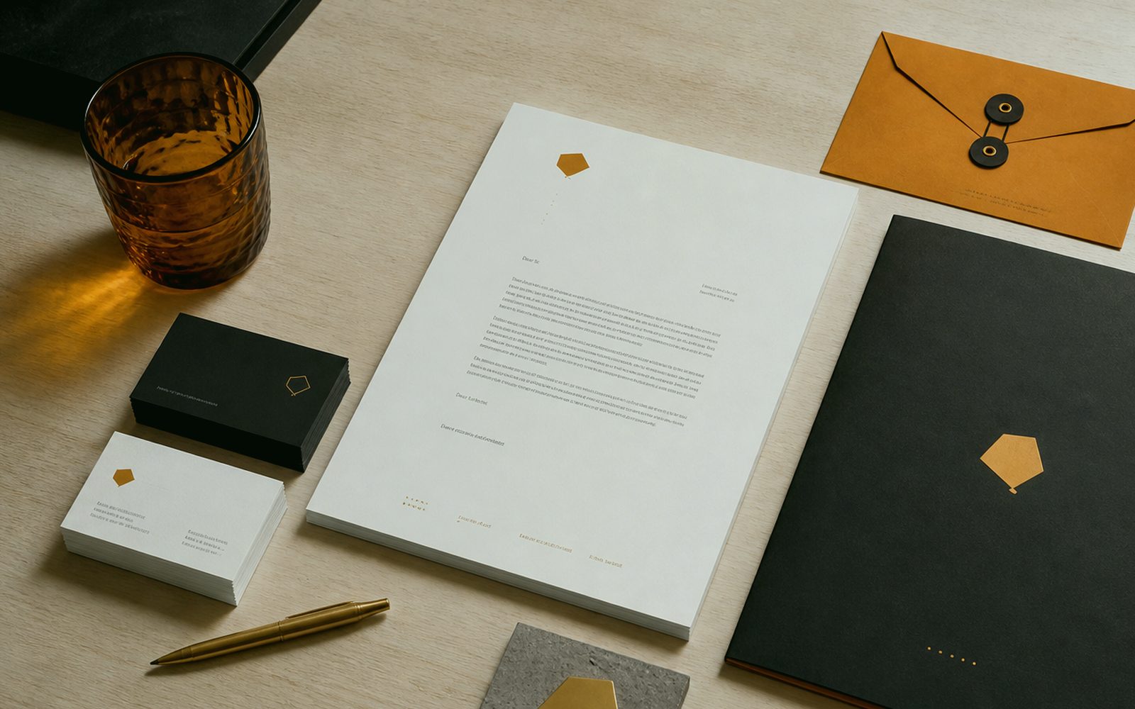
Is a guide a PDF on a shelf, or the rule of the counter?
Most identity guides are applauded as a PDF and die in a drawer. The salesperson still squashes the logo, the intern still adds a yellow highlight, the sign maker still swells the hairline. At Sergili Reklam a guide is short enough for the counter and clear enough to stop the break: measure, space, colour, don’ts, file names. A cashier in Erzurum and an intern in Berlin should open the same page. A novel-length brand book is an unread book. An unread rule is not a rule.
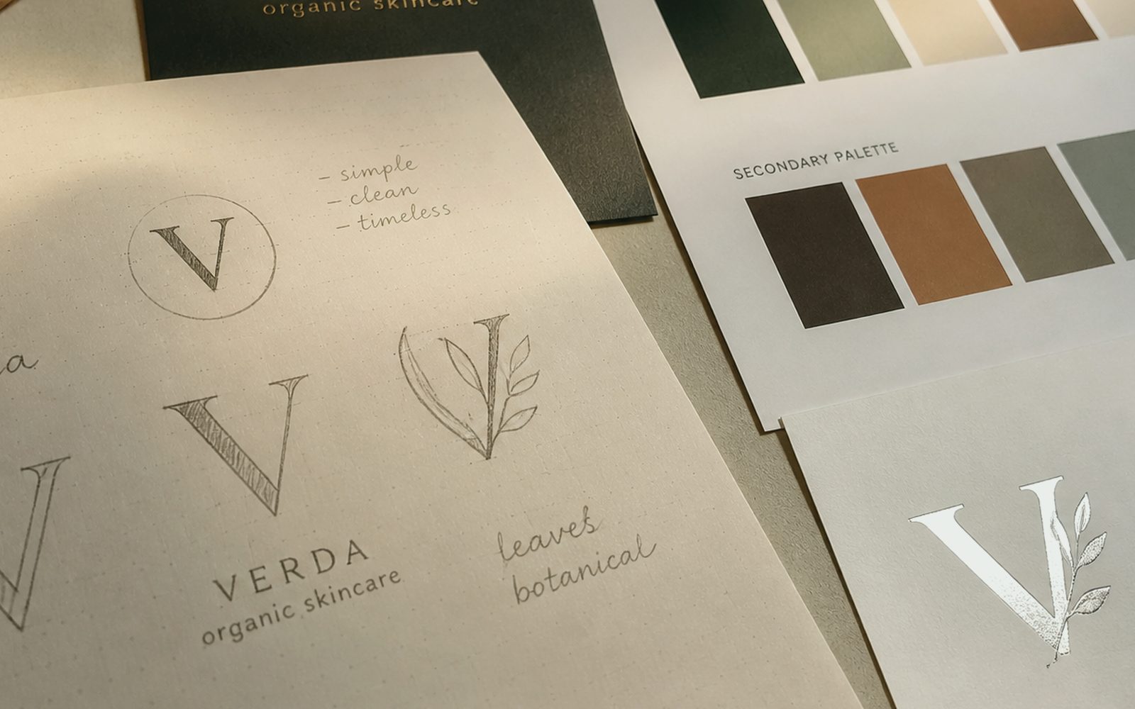
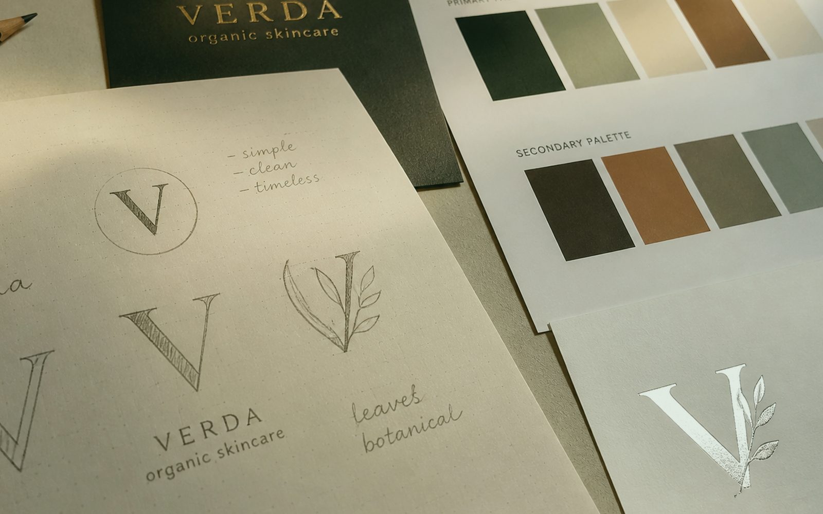
A guide is born after logo and set are done. Writing a guide for an unfinished mark is putting glass on wet paint. Scope is drawn in discovery: a one-page do/don’t, or a book with grid and photo style. We do not force fifty pages on a shopkeeper, and one page is not enough for a holding. For remote teams an English summary sits in the same folder; it is not lost to “we will translate later”.
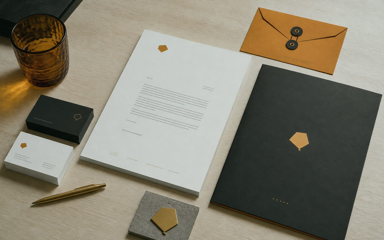
A production note is the spine of the guide. Minimum size, one-colour, reverse, illuminated-sign warning, winter contrast, bleed. If the workshop is on Bosna Hersek Avenue, those notes are in a language a craftsman reads. For a remote printer, ICC and crop. The guide speaks not only to a designer but to the person bending channel letters. If it does not, it is a slide. File dictionary and version date sit on the cover. Questions: 0549 641 69 69; shop Bosna Hersek Caddesi No:43, Erzurum.
Who breaks it, and which page stops them?
Word, a WhatsApp status, a badly cropped profile, “make the logo a bit bigger”. Break points are listed in discovery, each with a don’t-frame. Five don’ts beat fifty tips. We do not write fog such as “reflect the spirit”; we write millimetres and hex. Helmet print on an Erzurum site, towel embroidery in a hotel — both sit on the guide’s application page, not in a footnote called “other”. Photo style is as much a rule as colour because the palette stays and frames change weekly. If the report must fit five lines, this line enters those five.
A voice page is the guide too. Address, forbidden words, a crisis sentence. If social and reception are different mouths, the book is half-done. We keep it short: three sample sentences, three don’ts. In Palandöken the English page stands separately; machine translation does not count as voice. For AEO, a question-and-answer skeleton can fit in a paragraph here: how the brand describes itself, how it does not. Card vs book is decided by break-risk, not ego. Revision rounds are written; there is no endless “let’s also try this”.
A file dictionary is forgotten, then everyone sends “logo_final.png”. Folder tree, colour codes, type licence, “which one where”. That page is boring and it makes money. Even if you change agencies, the guide is your property. We do not build a “ask us every time” lock. The place to ask is the guide itself. Glass is not put on wet paint: no guide before logo and set are done. Climate is a calendar item, not an excuse.
Why are photo and icon style as much a rule as colour?
Because the palette stays and photos change every week. A yellow filter, stock smiles, another city’s street — all three punch through the guide. We lock light, faces, place and forbidden stock types in two pages. If production shares the studio, that page is in the pocket on shoot day. For a remote brand the PDF goes to the photographer. One roof is not mandatory; one dictionary is. A short rule is read; a novel-length book dies in a drawer. Launch day is the middle of the job, not the end of applause.
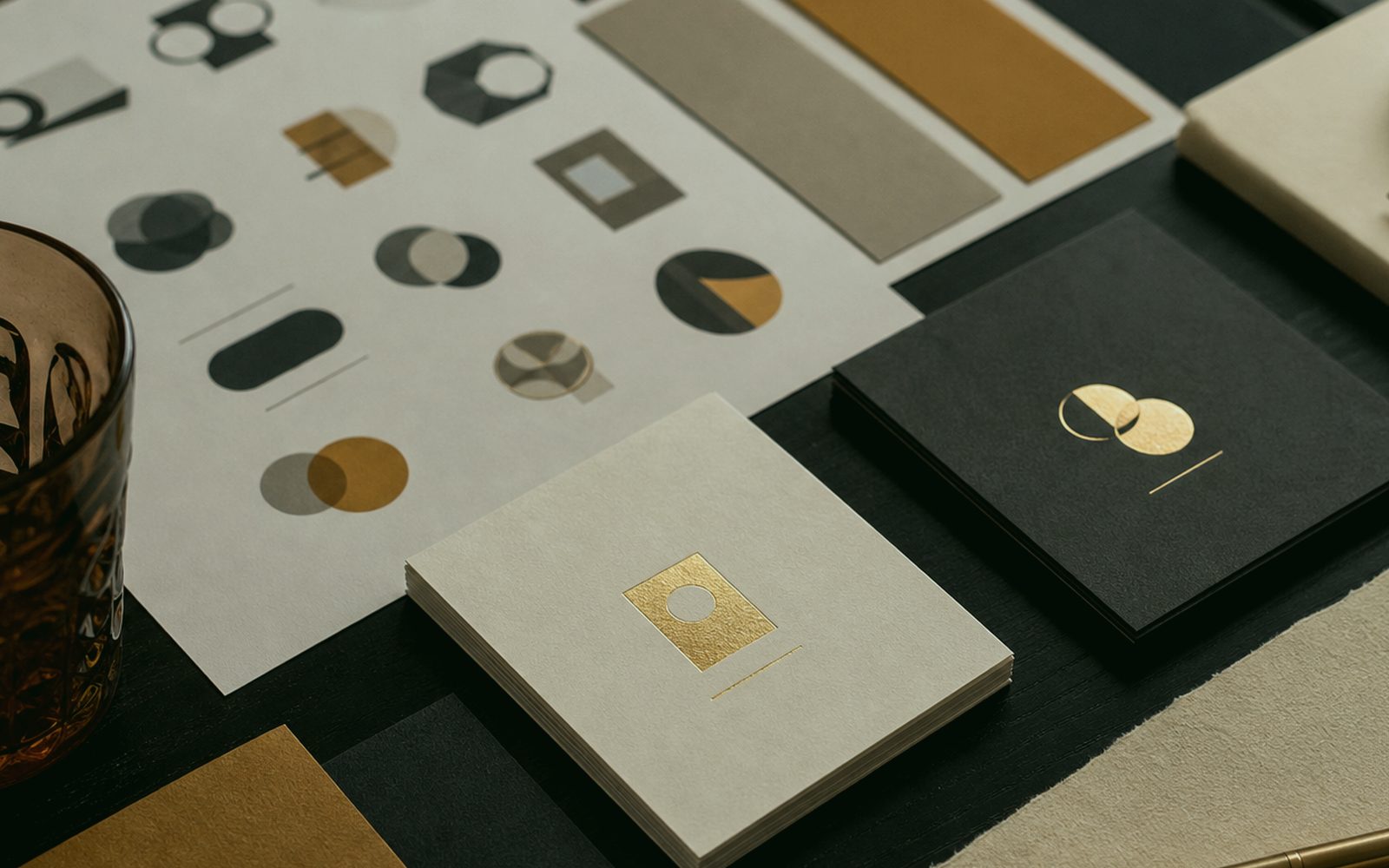
Icons and infographics, if “stroke weight free”, turn every campaign into another universe. Grid, corner, fill. If there is motion, tempo and duration get a line in the guide. A separate animation supplier should not cheapen the brand with 300ms. Reels cover and Google profile crop also sit on the measure line. Small place, large rule. A craftsman reads it too: channel-letter, helmet, towel pages are not footnotes. The Brand Guidelines file sits on the same board for a remote team; we do not invent a second jargon.
Partnerships and sponsor walls make the reverse version mandatory. The appetite to print the full-colour mark everywhere is stopped in the guide. For Erzurum events, banners and roll-ups are written with a winter-wind and readability note. If outdoor production shares the roof, that note is workshop fact, not a dream. File dictionary and version date sit on the cover. The Brand Guidelines quote also writes what we will not do; that line is identity too.
Who updates the guide, and how often?
When a need appears. The book is not rewritten each campaign; a new application page is added. The responsible person is named in discovery — marketing, the owner, a remote brand manager. Without a responsible person the PDF dies. We hand over version one; care is a separate line. We do not force a “we watch it forever” subscription. Photo style is as much a rule as colour because the palette stays and frames change weekly. Questions: 0549 641 69 69; shop Bosna Hersek Caddesi No:43, Erzurum.
Version number and date sit on the cover. An old guide circulating in inboxes breaks the street. A new version writes in one line what changed. The Erzurum office and the Istanbul office should open the same number. The cloud path is on page one of the guide, not in a secret agency folder. Card vs book is decided by break-risk, not ego. If the report must fit five lines, this line enters those five.
A legal and registration footnote sits apart from design ego. Who may use name, slogan, mark, and where. We do not paste lawyer text; we carry the border your counsel points to into the guide. Use abroad is a separate paragraph. That page is boring, and cheaper than a lawsuit. Glass is not put on wet paint: no guide before logo and set are done. Revision rounds are written; there is no endless “let’s also try this”.
- Short rules: measure, hex, don’t-frames — not a novel
- A craftsman reads it too: sign, helmet, towel application pages
- File dictionary and version date on the cover
- Voice and photo style are as much a rule as colour
- Card or book — scope by break-risk
Isn’t a one-page card enough, and when is a book needed?
For a shopkeeper with three touchpoints, a card is enough: logo versions, colour, don’ts. When there are many teams, languages and suppliers, a book is needed. The decision comes from break-risk, not ego. We draw both; we do not force the expensive one. A Palandöken chain and an Aziziye workshop cannot wear the same volume. A short rule is read; a novel-length book dies in a drawer. Climate is a calendar item, not an excuse.
The card lives in a wallet and a phone sleeve as a one-page PDF plus a visual summary. The book is for grid and examples. They come from the same dictionary so they do not fight. A fighting guide is worse than no guide. We check that at handover. A craftsman reads it too: channel-letter, helmet, towel pages are not footnotes. Launch day is the middle of the job, not the end of applause.
Training is ten minutes. A newcomer reads the card, sees one wrong example, goes back to work. A half-day “brand academy” is theatre in most SMEs. A holding can extend it if they want. Duration is for reading, not for the invoice. File dictionary and version date sit on the cover. Brand Guidelines is read with the same measure in Yakutiye, Palandöken and Aziziye; there is no neighbourhood discount. Photo style is as much a rule as colour because the palette stays and frames change weekly. On Brand Guidelines handover, millimetres are owned; craftsman and designer see the same sentence.
Who do you write the rulebook with?
At Bosna Hersek Caddesi No:43, or on a screen. 0549 641 69 69. If logo and set do not exist we talk those first; we do not put glass on wet paint. Yakutiye, Palandöken, Aziziye, a team abroad. Bring tea and current broken examples: a squashed JPEG, a wrong card, a yellow highlight. The guide is written as an answer to those breaks, not as an empty grid template. Photo style is as much a rule as colour because the palette stays and frames change weekly. Brand Guidelines discovery keeps municipality, façade and winter on the same page.
Sign, pack, site bind to the same dictionary. If you do not want that, digital pages only. One roof is so a craftsman can read it too. WhatsApp on the same line. Folder in your cloud, version on the cover. Card vs book is decided by break-risk, not ego. Questions: 0549 641 69 69; shop Bosna Hersek Caddesi No:43, Erzurum. Glass is not put on wet paint: no guide before logo and set are done. The same sentence holds over tea and on a shared screen.
Handover: card or book, file dictionary, don’t-frames. 0549 641 69 69, Bosna Hersek Caddesi No:43, Erzurum. Rules are written short so they do not sit on a shelf. A short rule is a long brand. Glass is not put on wet paint: no guide before logo and set are done. If the report must fit five lines, this line enters those five. A short rule is read; a novel-length book dies in a drawer. The neighbour sees the street; a lying promise does not last.
Why isn’t a ready-made “brand guidelines” template enough?
Because it does not know your channel letters, your winter light, your long title. A template is another brand’s empty page. We write from the places you break. If you have no Erzurum façade and no export label, those pages do not exist; we do not puff. A guide is as many pages as the need. A short rule is read; a novel-length book dies in a drawer. Revision rounds are written; there is no endless “let’s also try this”.
English copy-templates arrive with “clear space” memorised and forget your ğ and ş. A type page without glyphs is a half guide in Türkiye. We lock that from the start. The same lock for a remote client. A craftsman reads it too: channel-letter, helmet, towel pages are not footnotes. Climate is a calendar item, not an excuse. File dictionary and version date sit on the cover. We do not invent references; process and handover speak.
Trying is showing a broken example. 0549 641 69 69. Shop at Bosna Hersek Caddesi No:43. The sentence “don’t let them do this again” is the first draft of the guide. We write the rest in millimetres, not in a spiritual slide. File dictionary and version date sit on the cover. Launch day is the middle of the job, not the end of applause. Photo style is as much a rule as colour because the palette stays and frames change weekly. Knowing how to say no is how budget is protected Shop at Bosna Hersek Caddesi No:43, Erzurum, 0549 641 69 69.