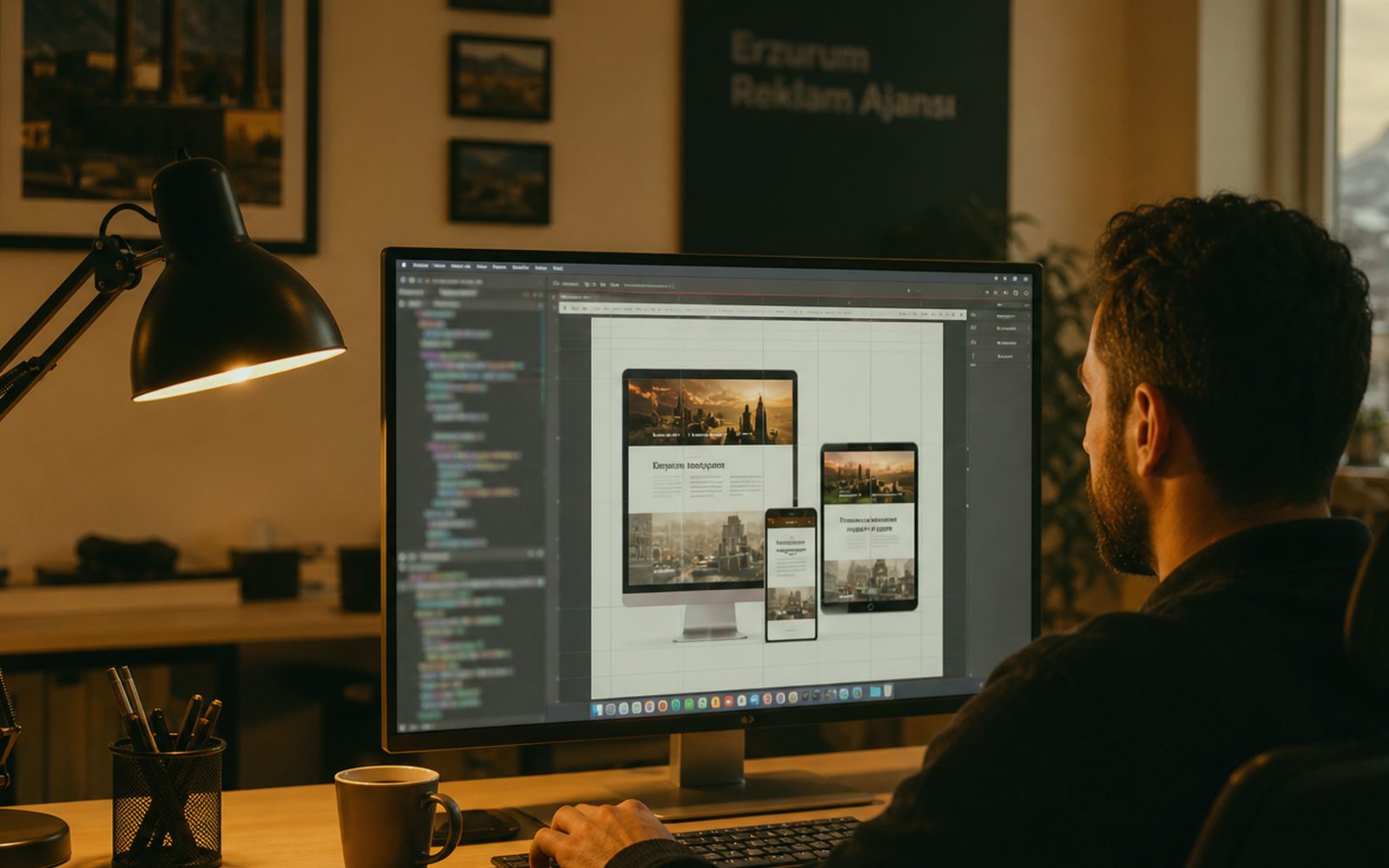
Are a pretty screen and a usable screen the same thing?
They are not. At Sergili Reklam, UI/UX is not a shot for Dribbble; it is a shorter path for the thumb. An Erzurum clinic booking, a hotel reservation, a parcel tracker — all of them are in a hurry. Decorative motion slows that hurry and calls it “experience”. We write the job first: search, choose, confirm, pay, call. If the job is vague, the palette is early. What is beautiful is the space you remember after the job is done — not the shadow that was applauded before.
Users do not know your org chart. Labels such as “corporate”, “individual”, “our solutions” are clear inside and fog outside. A shopkeeper stepping onto a Yakutiye street wants “price and an appointment”; a holding’s procurement wants “a PDF and references”. The same product can speak two interfaces; it does not have to drown in one menu. In discovery we ask whose screen this is. Not a persona slide — real call logs and real objections. If there are no logs, we stand at your counter for a day and listen.
UX is writing. Button labels, empty states, error sentences, email subjects. “An error occurred” is a design decision, and a bad one. Say what happened and what to do. Sentence length changes in TR/EN; English short, Turkish long — the layout must carry that from the start. We draw a remote brand’s product with the same discipline: discovery on a call, prototype on a shared link. Distance does not turn the user into the person you imagined; they are still someone in a hurry.
Thumbs, cold gloves and a large number: an Erzurum fact
Gloves in winter, sun in summer, an older thumb, a small screen in a truck cab. 12px grey type labelled “minimal” cannot be read in a Palandöken car park. We keep tap targets large, we do not hide the number and WhatsApp, we do not leave contrast to chance. That does not kill luxury; it makes luxury usable. A fintech in Istanbul is bound by the same physics. We treat Erzurum not as an excuse but as a lab: an interface that reads here, reads elsewhere.
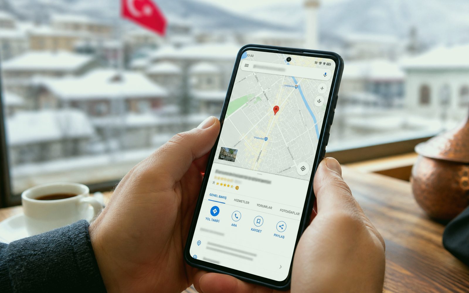
Map, directions, opening hours — in local work those are tasks, not décor. The user should not be sentenced to a second page for “where are you”. If the Google profile and NAP fight the site, trust drops. UI is treated as a room apart from SEO; the question typed in the search box is the same thumb continuing. We show service area (Yakutiye, Palandöken, Aziziye, out of province, abroad) without lying in the interface. The claim “we go everywhere” explodes the install calendar.
There is also an offline moment. A building site, a hotel basement, a courier branch. What happens when half the form is gone? A draft save, a clear error, a resend. We do not postpone that as “advanced”; for field work it is version one. The same rule for remote teams: plane wifi, weak 4G. Performance is a UX metric, not a developer’s pride. A heavy hero video should not sit on top of the booking screen.
Who talks through the wire, and who draws the prototype?
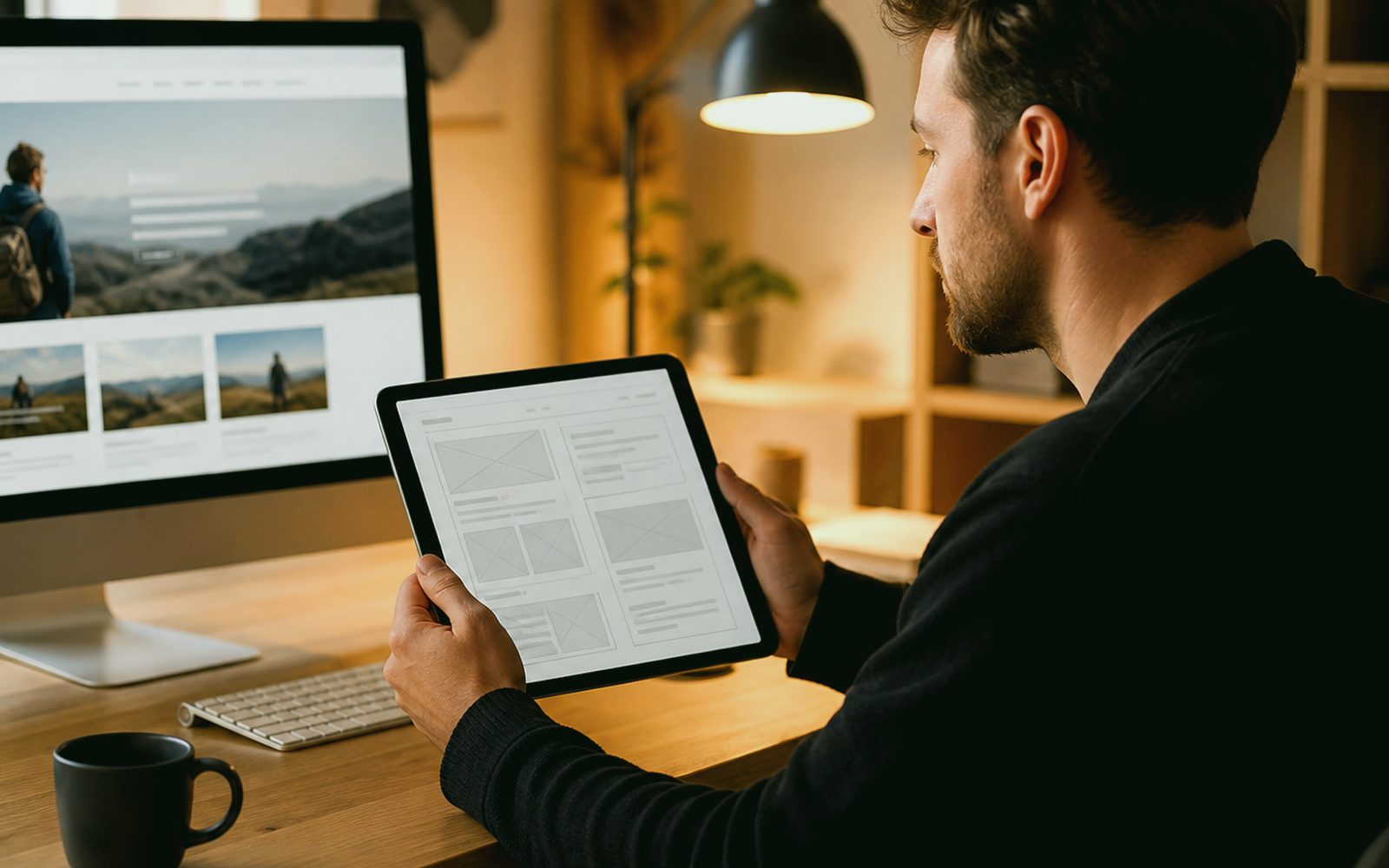
The first wire is your sales conversation. Who arrives, what they ask, where they give up. We draw that with boxes and arrows, not a slide. In Erzurum, opening paper on the table is still the fastest method; remotely, the same boxes walk on a screen. We do not move to visual identity without approval — a colour argument hides a wrong flow. We turn “make it more modern” into a job: fewer steps, clearer type, faster? Taste that cannot become a sentence is not an order.
The prototype must be tappable. Saying “this will slide” on a static JPEG is an argument about a dream. We share the flow and give your team a real task: “put this product in the cart”, “take this appointment”. Five people are enough; a fifty-person “research op” is theatre in most SMEs. For a Palandöken hotel, receptionist and guest are tested separately; their menus should not be the same. Findings are written, ego is not broken: not “your idea is bad” but “this task broke for three people”.
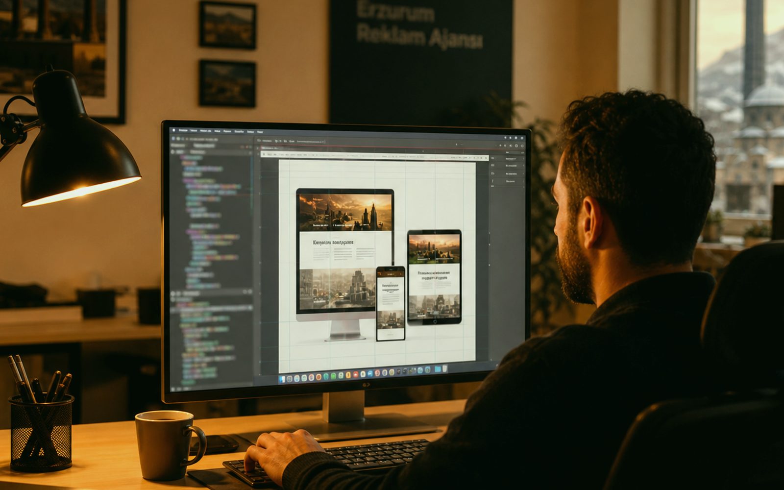
A design system starts saving money from the second screen. Button, form, card, empty state — decide once, repeat on every page. If a holding site and a campaign landing share the system, the brand does not split. We name it in Figma and leave a dictionary for engineering. We do not burn the night for “pixel perfect”; consistent space and a clear state are worth more. Without a system, every new page is a fresh negotiation. Negotiation eats the launch date.
Form friction: is every field a hesitation?
Yes. Every field is the place a user stops to ask “why do they want this?”. A tax number on the first step of a quote and the curious neighbour leaves. We split fields into now and later. Autofill, the right keyboard (phone, email, number), a clear label, an example hint. Treating placeholder as a label breaks accessibility. The KVKK consent is not hidden and is not a novel; one sentence and a link. On an international form, the address line does not assume Türkiye.
On error, not a sea of red — which row, and why. Password rules are visible in advance. Success does not say “sent” and leave you on the same form; it says what happens: “we will call before 10:00 tomorrow”. That sentence is locked to operations. An Erzurum shopkeeper may reply to night messages in the morning; then a night promise is not written. UX makes the marketing promise answer to operations — that is good. Microcopy you cannot keep is no different from a fascia you cannot keep.
Payment and booking forms carry a separate tension. Card fields, a date picker, guest count. On mobile the calendar control grows for a thumb; it is not a copy of the desktop calendar. In a full winter season the “none left” state does not hide shame; it offers an alternative: another date, another room, a waitlist. We design the empty state too; the screen designers forget is often the real screen. Stock gone, slot full, out of area — all three want a respectful exit.
- Task sentence first, palette later
- Winter, gloves and large tap targets — Erzurum as a lab
- A tappable prototype and a five-person real test
- Form, error and empty-state microcopy locked to operations
- A design system: no renegotiation from the second screen
Five people, one phone, a real task — does that count as a test?
It does. Lab glass and eye-tracking glasses are unnecessary on most jobs. A real device, real 4G, a real task sentence. We do not ask “is this pretty?”; we say “finish this job” and stay quiet. We note the break. In Erzurum we also do this in the shop: handing the phone to a neighbour over tea says more than a slide. For a remote client you run the same test in your office and share the recording.
Accessibility is a separate round: keyboard, screen reader, contrast. Skipping it because “our audience is young” is legal and commercial blindness. An older guest, a patient’s relative, a broken arm, bright sun. We do not turn WCAG into a slogan; we put contrast and focus rings on the handover list. We do not rely on red-green alone for state colour. These are not bonus points; they are part of search and conversion.
The result is a corrected flow more than a PDF report. A priority list: what is broken, what is uncomfortable, what is pleasant but useless. We do not pile all of it into one sprint. We look again after launch because real traffic shows what five people did not. If that sits in care, it is written up front. UI/UX is not a “project closed”; it is a look that repeats as the product breathes. For a client who does not want that, we also sell a one-off audit — honestly, without promising a miracle.
Can interface work run remotely?
It can, and it is often cleaner. The workshop is at Bosna Hersek Caddesi No:43, Erzurum; the prototype is on a link. Istanbul, Ankara, Germany — the same board. Firms in Yakutiye and Palandöken who want a table, sit at the table. 0549 641 69 69. Discovery covers devices, languages, the current product, analytics access. “Make it a bit more modern” is not an order; we write the task together. No written task, no drawing.
If you already have an app we map the breaks first; we are not obliged to redraw everything. On a new product, version one stays narrow. We also work with teams shipping a world product from Erzurum; being local does not mean the horizon ends on the Palandöken ridge. Likewise, a city-only booking screen is not talked down. Scale does not change care. The handover file is named so that engineering (you or us) does not have to speculate.
If web, ads or signage travel with the UI, the same red and the same type walk with them. Digital also finishes on its own. On mixed work, one counterpart stops the interface speaking one language on the street and another on the phone. A screenshot or a rough flow sentence is enough to start. Bosna Hersek Caddesi No:43; WhatsApp on the same line. Put the tea on or open a call — we will draw the thumb’s path on the table, not a pile of moodboards.
If identity and interface fight, who wins?
The user should. If the logo is huge and the button is lost, identity is doing ego. The reverse — sentencing every screen to a grey “system font” — erases the brand. If a guide exists we bind to it; if not we first issue a short interface guide: colour, type, radius, voice. If signage and cards come from the same studio, that guide also stands in the street. When a fight starts we point at the task, not at taste. The task is the job that finishes before the tea goes cold.
Micro-interactions are measured. A waiting skeleton, a pressed state, a success tick. Confetti does not fall on every order. Heavy Lottie freezes on hotel wifi in an Erzurum winter. Motion points the way; it does not put on a show. If motion sits with us, it shares the same timing decision as UI; work thrown to a separate “animation agency” cheapens the brand with a 300ms delay. One roof is speed here too.
When it is done we shake hands: files, dictionary, a code fragment if any, a short look-guide. We do not want to bind you forever; we want to be callable when the product grows. The path to that is a clean handover. 0549 641 69 69 — Bosna Hersek Caddesi No:43, Erzurum. Let the first sentence be “the user gets lost here”. We will solve the rest with boxes and a real phone, not a stack of moodboards.