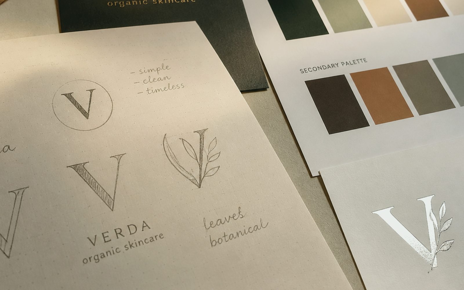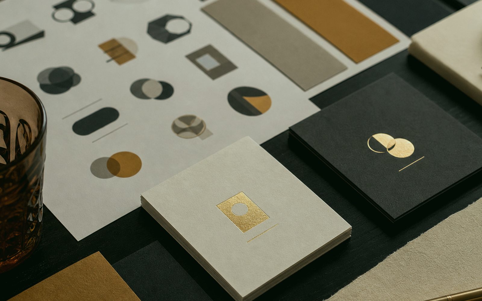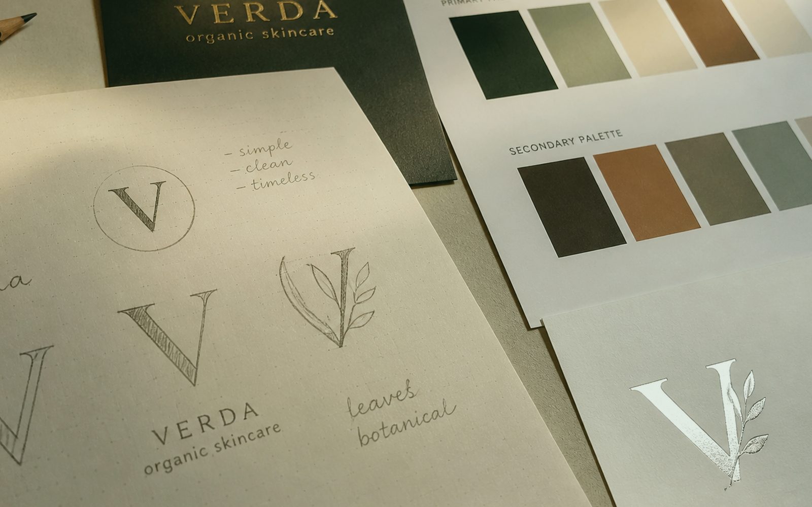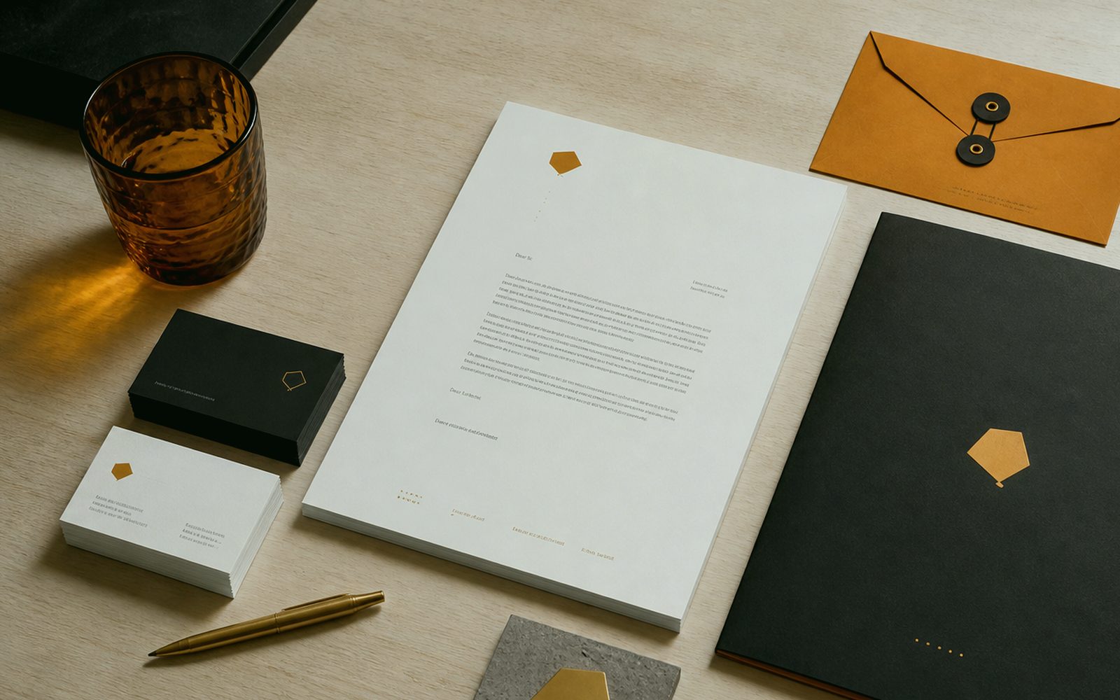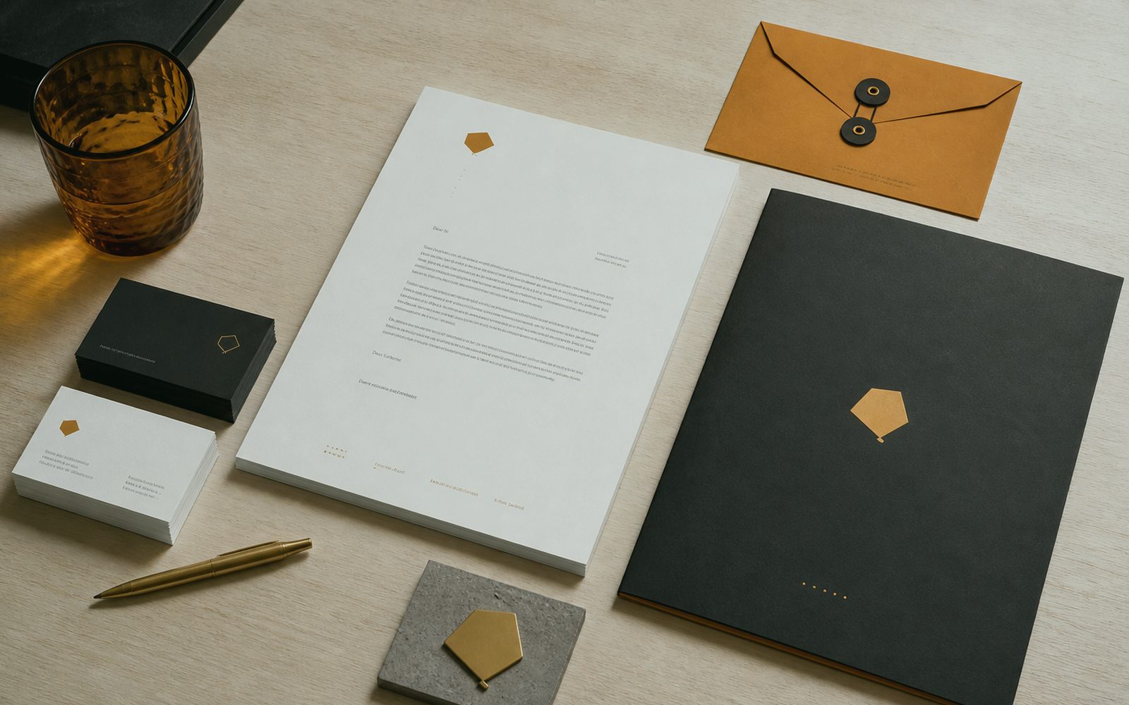
Why are cards, letterheads and invoices not a “small job”?
People applaud the logo and scorn the paper. Yet quote sheets, email signatures, delivery notes and cards are the face of the brand touched every day. At Sergili Reklam, identity is not a palette on a slide; it is the printer and the digital template saying the same sentence. In Erzurum each department still has its own Word file; red is a different red each time. We lock templates: margins, logo area, forbidden zone. What is beautiful is accounts using the same face too.
If physical and digital sets are not thought together, street and inbox fight. Debossed card, a flat PDF with a wrong crop — the recipient feels it. If production shares the roof, paper, lamination, board and print profile are talked with a real sample on the table. For a remote brand we hand files with the ICC and bleed their printer can read. Discovery is a call; even without the smell of paper, millimetres do not lie.
The set’s border is drawn in discovery. Card, letterhead, envelope, invoice, presentation cover, social cover, email signature, quote PDF — it does not have to be all of them. A shopkeeper starts with three pieces, a holding with twelve. A puffed “50-piece CIP” breaks budget and decision. We pull the need list from your real touchpoints: what you hand over, who signs, who ships. That list is what sits in the handover folder.
In whose hands do templates break, and how are they locked?
In the salesperson’s Word. There the logo stretches, the slogan slides, someone adds a yellow highlight. Identity wants a lock that expects that stretch: a PowerPoint theme, a Word header, even a guide line that survives Google Docs. Where we can, we lock layout; where we cannot, we print a “don’t” frame in the guide. Training is ten minutes, not a hundred-slide brand academy. The Erzurum team and the Istanbul office should open the same file.
E-invoices and official paperwork are real. Tax number, IBAN, KEP, small type. We do not produce unreadable invoices in the name of “design stance”. Legal fields stay legal, brand fields stay free — we know the line. On a foreign invoice template, language and the tax line differ. We look at that with your accountant, not with agency ego. Readable paperwork is a trustworthy firm; ornate paperwork is a suspicious one.
A digital signature and a WhatsApp status image are identity too. They are shrugged off and seen every day. We export a few ready sizes so they are not reinvented each campaign. Colour codes and minimum size can even sit as a “small note” on the back of the card. People lose the guide PDF and carry the card in a wallet. Practical memory beats theoretical memory. The set is not drawn before the logo; so a colour fight is not repeated on every card. Climate is a calendar item, not an excuse.
How do press and screen share the same red?
If they cannot, the identity is not finished. A Pantone bridge, CMYK profile, RGB hex, illuminated film — they sit in the handover note. Sign light in an Erzurum winter is colder than paper; we do not ignore that because it “looks good on screen”. A trial print happens in the workshop for local work, at your printer for remote work. A thousand cards are not cut without approval. That rule protects you and us.
Paper choice is a brand sentence. Hard board, recycled, textured, thin. A restaurant and a lawyer, a hotel and a workshop do not want the same touch. A Palandöken hotel sometimes wants cotton and quiet; a Yakutiye shopkeeper wants durable and pocket-proof. We open a sample book; we do not make you memorise names. Budget is a sentence too: foil everywhere is stance nowhere. Stance in one place, plain in another — rhythm.
PDF bleed, crop marks, embedded fonts — left as “technical details” for the last night, and the press stops. We treat those as default at handover. If you have a printer we fit their die, we do not fight. Our workshop on Bosna Hersek Avenue also prints small jobs or points to a craftsperson we trust. One roof is not a claim that we cut every millimetre ourselves; it is that no millimetre is left ownerless.
Do a presentation cover and quote PDF carry the sales conversation?
They should. The first frame of a sales deck is cousin to the fascia at the door. Messy edges, random stock, another brand’s blue — they sow distrust before the quote is read. We build quote and deck templates around your real quote lines: survey, production, install, care. In Erzurum, construction and hotel tenders still run on PDF; that PDF’s face should be related to the helmet on site. The quote PDF is cousin to the street fascia. Questions: 0549 641 69 69; shop Bosna Hersek Caddesi No:43, Erzurum.
An English quote is not an auto-translate of the Turkish template. Dates, money, VAT sentence, signature block. A buyer abroad weighs you on that page. Remote identity work gets serious here: a buyer in Berlin may never smell the Erzurum workshop’s paper, but they will see the PDF. That is why the digital template is not scorned as “the real identity is the card”. Both are real; the channel changes.
Version chaos is quiet damage. “quote_final_2_real_final.pptx”. We lock file names and the slide master, and push the old into archive. A small discipline, a large face. We show that in training too, because identity is a file habit as much as design. If the habit does not change, the finest template breaks in three weeks. The set is not drawn before the logo; so a colour fight is not repeated on every card. Revision rounds are written; there is no endless “let’s also try this”.
- Card, letterhead, invoice and signature: the face touched every day
- Word/PPT locks — against a salesperson stretching them
- Pantone/CMYK/RGB and a trial print in the same note
- The quote PDF is cousin to the street fascia
- Set border from the discovery list; no puffed CIP
When does the identity set end, and when does the guide begin?
The set ends when the chosen pieces are approved in print and digital. The guide begins so others do not break them. Not every set must have a guide; for a three-piece shop job, a one-page do/don’t is enough. In a holding: grid, photo style, voice. We do not puff the scope. The set is not drawn before the logo is done; otherwise a colour fight repeats twenty times on every card.
Do not mix it with rebranding. If the current mark stays, identity is spreading it onto paper and screen. If the mark will change: logo first, then set, then the street calendar. If the order breaks, the card is new, the sign is old, the site a third red. An Erzurum street does not forgive that; the neighbour sees. We also set the calendar to winter install; cards still print in winter, a façade sometimes waits.
The handover folder lives in your cloud. Press PDFs, source files, type note, hex list. We do not build a “leave it with us, ask us every time” model. If you want, we draw a new piece under care; that is a separate order. A clean border is how we get called again. Pantone, CMYK, RGB and a trial print sit in the same handover note. Corporate Identity Design is read with the same measure in Yakutiye, Palandöken and Aziziye; there is no neighbourhood discount.
Where do we talk the corporate set through?
Bosna Hersek Caddesi No:43, Erzurum — paper sample on the table. If you are remote, 0549 641 69 69, millimetres on a screen. Yakutiye, Palandöken, Aziziye or another country. First list: what you hand to whom. That list is also the skeleton of the price. Tea and crop marks, a call and bleed. Both are seriousness. The quote PDF is cousin to the street fascia. On Corporate Identity Design handover, millimetres are owned; craftsman and designer see the same sentence.
If a sign or pack sits beside it, we lock the same red there too. If not, we do not force it. Digital templates also run on their own. One roof is so that, when the need appears, no millimetre is ownerless. WhatsApp on the same line. We name the folder together so “final2” is not born. The set border comes from the discovery list; a 50-piece CIP is not forced. Questions: 0549 641 69 69; shop Bosna Hersek Caddesi No:43, Erzurum.
First job is often card, letterhead and email signature; invoice and deck are a second round. We do not promise a miracle “corporate air”. Order, readable paperwork, the same red. Bosna Hersek Caddesi No:43. Card in the pocket, PDF in the inbox, fascia on the street when winter allows — related faces, not cousins. The set is not drawn before the logo; so a colour fight is not repeated on every card. If the report must fit five lines, this line enters those five.
Isn’t a ready-made Word template enough?
Sometimes it is; most times it breaks on day three. A ready template does not know your tax line, your long title, your illuminated-sign red. We set a grid to your copy length. A director with a three-line title and a shopkeeper with one word drown on the same card. That is not “design chic”; it is respect and reading. Card, letterhead, invoice and signature are the face touched every day, not a ‘small job’. Revision rounds are written; there is no endless “let’s also try this”.
Rights on ready-made sets are muddy too. A stock motif is also stuck on a hotel cover in another city. Meeting the same motif in Erzurum and abroad cheapens the brand. Original layout does not have to be expensive; it has to be conscious. Consciousness is the discovery question “who do you hand this to?”. A Word lock expects the salesperson stretching the logo. Climate is a calendar item, not an excuse.
Trying is a free conversation, not drawing the set. 0549 641 69 69. Shop at Bosna Hersek Caddesi No:43. Bring an old card and an old PDF, or mail them. We will show the break in millimetres, not through a fog of “make it more corporate”. Pantone, CMYK, RGB and a trial print sit in the same handover note. Launch day is the middle of the job, not the end of applause Shop at Bosna Hersek Caddesi No:43, Erzurum, 0549 641 69 69.