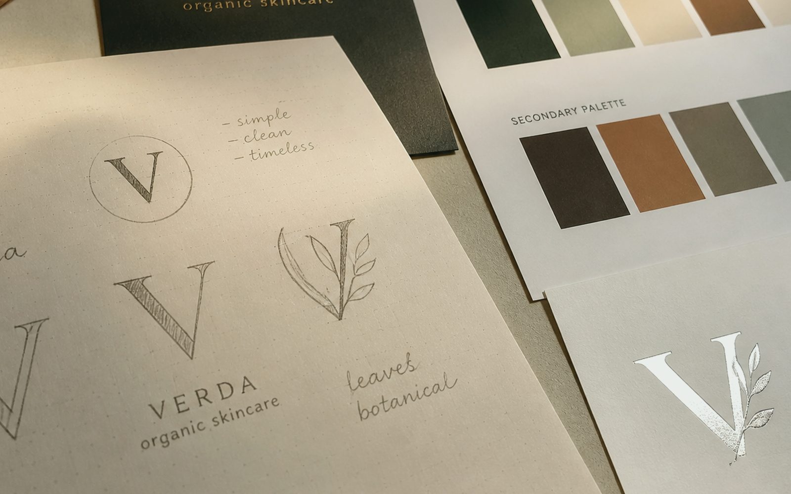
Is a logo a JPEG, or a system that can reach a fascia?
Most “logo jobs” end as a three-colour mark and an Instagram square; then the channel-letter craftsman cannot read the letter, the line shivers on a wrap, a fax-era JPEG circulates by mail. At Sergili Reklam a logo is a file our workshop on Bosna Hersek Avenue can also read: vector, space, minimum size, one-colour and reverse. A hairline that vanishes on an illuminated sign in an Erzurum winter also vanishes on summer letterhead. We draw remotely for a digital brand; if it will meet a physical face, production is talked at the same table. What is beautiful is a mark that stands everywhere.
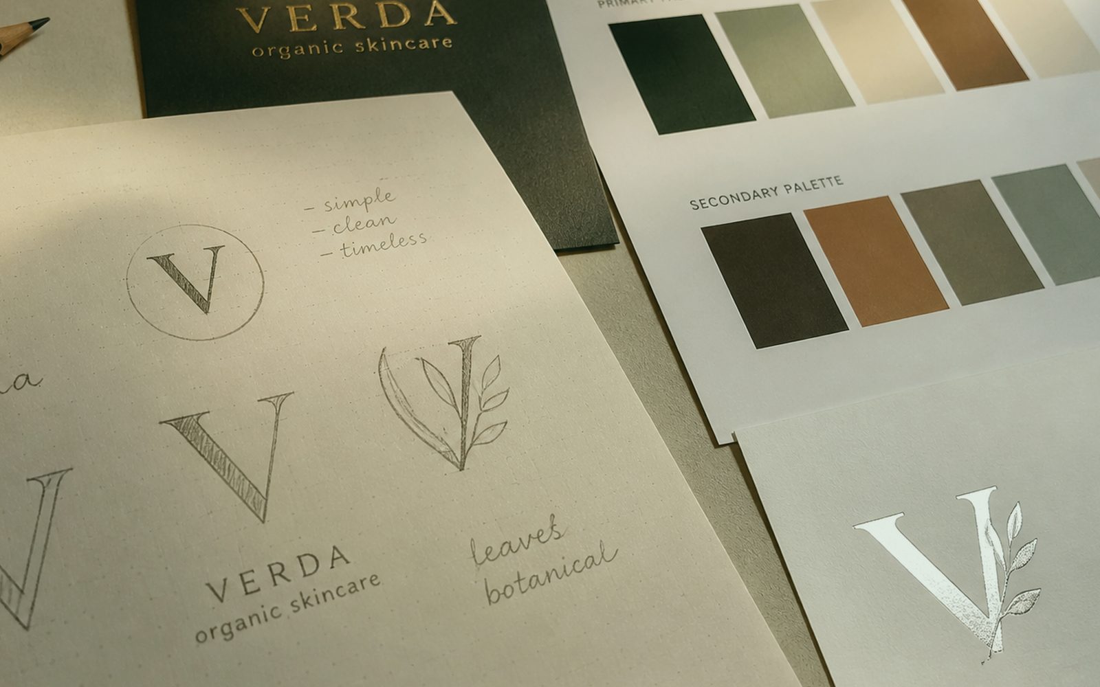
Name, slogan and symbol do not have to be born at once. Some shopkeepers want only lettering; some holdings split symbol and wordmark. In discovery we ask where it will stand: fascia, label, profile photo, invoice, helmet, a ski-hotel towel. White ground in Palandöken, stone in Yakutiye, a steel door in Aziziye — all three test a logo differently. We do not say “it works everywhere” without that test. Application frames come before the presentation slide.
A rival map is a ban on copying. The same curve on the same street, the same “mountain and bear” cliché, the same typeface. Tourism and food in Erzurum fall into that trap especially. We look for the sentence of your craft; we do not stick the city’s silhouette on everyone. The same rule for a foreign brand’s Türkiye vitrine: pasting an imported emblem is not enough; it must read locally. Remote work is a call; the signature is still yours, the production file still clear.
How many directions, how many rounds, who decides?
Unlimited directions are indecision. After a narrow discovery we show a limited set: two or three lines, each reasoned. A “let’s see lots more” round kills the bravest option and pulls toward the average. Whoever sits at the decision table also sits in discovery; if a nephew, a neighbour and a WhatsApp group will enter on the last day, we say so up front. Family firms are a fact in Erzurum — we respect that and write the process for it. A secret jury is a secret revision.
Revision is not endless “a bit more modern”. Rounds are written: space, weight, colour, slogan alignment. Each round keeps a task sentence. Not taste — where it will stand. If signage and cards share the studio, “this letter will swell as a channel letter” comes from a real craftsman at the table, not from an effect on a slide. That is the concrete benefit of one roof. A digital-only mark is also fine; then we talk screen and favicon, not fascia. Scope does not lie.
Name registration is law, not design. We search similarities with care and do not play lawyer. Domain and handles sit on the discovery list too; a fine mark should not die on an Instagram already taken. For a brand abroad, language and script (Arabic, Cyrillic) open from the start. A logo is not a translation; in some languages the lettering is redrawn. We do not leave that as “later”. The old mark does not come down overnight in winter; transition is asked, rebranding is a separate line. Climate is a calendar item, not an excuse.
Do colour and type that hold on screen also hold in winter light?
Pantone, CMYK, RGB and illuminated-sign films are not the same red. In handover we write which environment is master. LED cold light in an Erzurum winter, sun in summer, neon at night — all three shift a logo. A thin yellow line dies at night; we do not pick it because it looks “bright” in a deck. Contrast is tested separately for wraps and banners. If production is with us, a trial print or film sample is discussed. If production is yours, the same warning still sits in the file.
Type licences are forgotten, then every invoice and every site carries an illegal copy. We either pick a licensed cut or draw letters for you. A “free font” is enough on some jobs, not on a holding identity. We note variable fonts and cut sizes so web and signage walk from the same family. Turkish glyphs (ş, ğ, ı) must not break, nor English. That boring check is cheaper than shame on launch day.
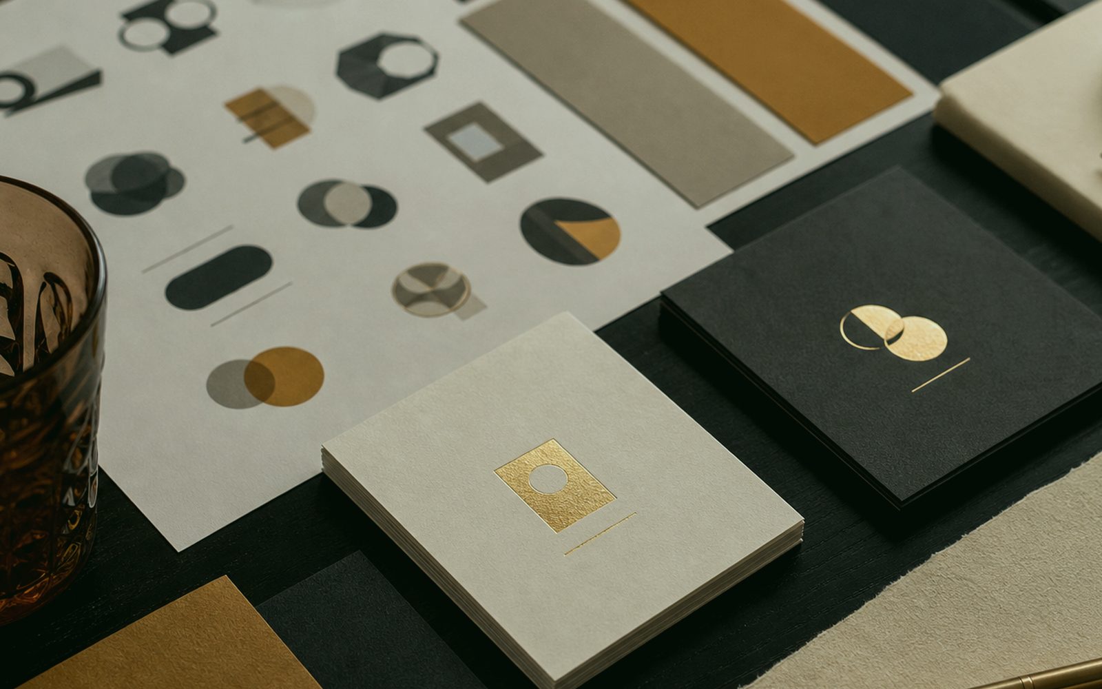
One-colour and reverse versions exist for sponsor walls and winter glass. Printing the full-colour mark everywhere tires the brand. Favicon, app icon, stamp, emboss — each wants reduction. We hand over a mark system, not one glossy PNG. Folder names, file names, a “which one where” note. Even if you change agencies, the file is your property. We do not build a dependency model. Winter LED kills a thin yellow hairline; it is not picked because it looks bright in a deck. On Logo Design handover, millimetres are owned; craftsman and designer see the same sentence.
Do sign, card and Instagram carry the same mark?
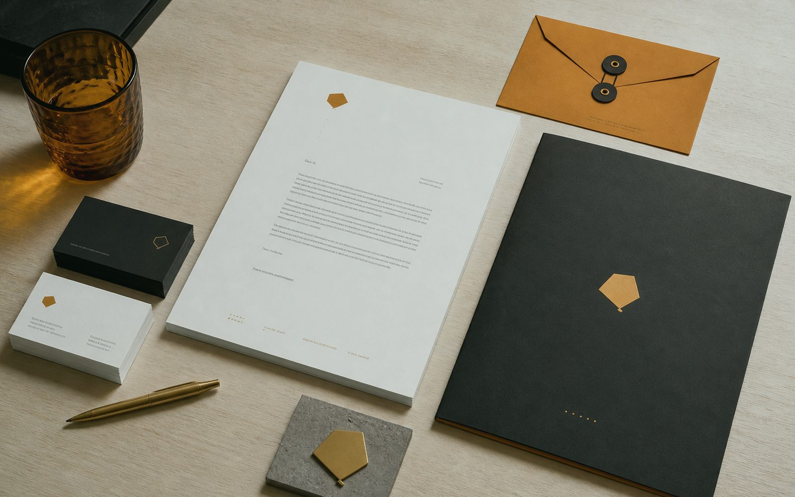
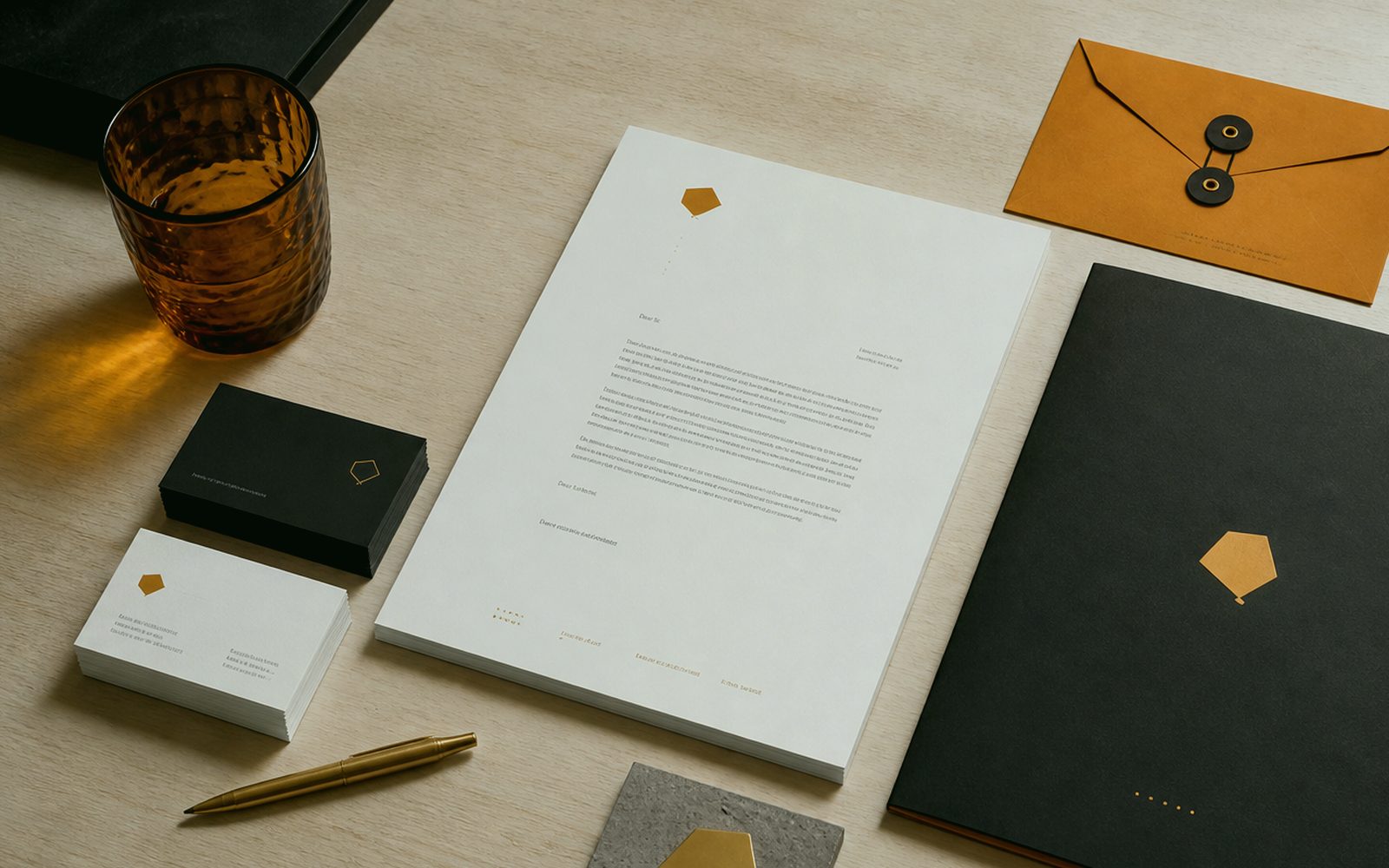
They should. If they do not, the logo is not finished. On the application board we show fascia, card, profile, a vehicle door — not a fake mockup on a slide, something close to your street. Yakutiye streets are narrow, totem height follows municipal rules; ignoring that in the drawing is how you later say “the letters cannot be read”. If production shares the roof, measure is talked there. If not, we still ask, because an unasked measure is a letter that gets cut.
Social crops are square and story; a fascia is horizontal. The mark must be recognised in both. At small sizes the symbol only, at large sizes the full lockup. That rule is written in the guide and as a footnote to the logo. We upload the file together so the Reels cover and the Google profile logo change in the same week. Scattered dates are a scattered brand. Remotely we upload on a call; local clients drop into the shop.
The old logo does not vanish overnight. Signs and fleets especially cannot be stripped in winter, and budget does not appear at once. A transition plan is cousin to rebranding; even when we only sell a new mark we ask “where does the old one remain”. An honest timeline is so the street is not left two-faced. In Erzurum the neighbour sees everything. Two faces, two stories, one distrust. The old mark does not come down overnight in winter; transition is asked, rebranding is a separate line. Revision rounds are written; there is no endless “let’s also try this”.
- Vector handover: sign, vehicle and screen read the same mark
- Limited directions, written rounds, WhatsApp juries named up front
- Winter light, one-colour and reverse versions are tested
- Application board: fascia, card, profile, door
- Files in your cloud; we point to your lawyer for registration
What sits in the handover folder, and what does not?
Vector (AI/SVG/PDF), colour and one-colour, reverse, minimum size, don’ts, a short use note. A JPEG alone does not count as handover. The type licence or custom cut. Animated intros are a separate order if needed; we do not bolt on a cheap GIF as a “bonus”. If motion sits in the same studio it shares timing with the logo. The folder lives in your cloud, not in our “archive levy”.
Presentation theatre stays short. Story, reason, applications, decision. A three-hour brand mythology eats a shopkeeper’s afternoon and worsens the decision. If a holding wants a longer narrative we write that too; still the mark stands before the sentence. An English handover note is prepared for teams abroad. The owner in Erzurum and the marketer in Berlin should open the same folder. Limited directions, written rounds; a WhatsApp jury is named in discovery. Launch day is the middle of the job, not the end of applause.
The revision window closes at handover; care is a separate talk. A “small tweak” six months later is a new job, not a sulk. We say that up front. A logo does not grow like a child; the guide grows, applications multiply. If a new need appears we sit again. A clean border protects a long relationship. Winter LED kills a thin yellow hairline; it is not picked because it looks bright in a deck. Logo Design is read with the same measure in Yakutiye, Palandöken and Aziziye; there is no neighbourhood discount.
Who do you draw the mark with?
The table at Bosna Hersek Caddesi No:43 — or a shared screen. 0549 641 69 69. Discovery: name, where it will stand, rivals, façade/municipal limits, language. Sketches happen on paper or on a tablet. Yakutiye, Palandöken, Aziziye or another country: the scope is written with the same clarity. Put the tea on or open the camera. Let the first sentence be “where will it stand?”, not “make it modern”. The application board shows fascia, card, profile and a door. The Logo Design quote also writes what we will not do; that line is identity too.
If a sign, a vehicle or a label sits beside it, talking measure at the same time protects money. A digital-only mark is also enough; we do not force more. The one-roof advantage is for those who need it. File formats and licences sit on the quote line, not lost in a footnote. For registration we point to your lawyer; we do not replace them. We point to a lawyer for registration; the studio does not play counsel. Questions: 0549 641 69 69; shop Bosna Hersek Caddesi No:43, Erzurum.
Once decided, applications and, if needed, a guide are the next door. A logo also finishes on its own. 0549 641 69 69, WhatsApp on the same line, Bosna Hersek Caddesi No:43, Erzurum. Putting the mark on the street and on screen the same day is possible; winter install is a separate calendar, not the drawing. The drawing finishes remotely. The fascia, when the ice thaws. The old mark does not come down overnight in winter; transition is asked, rebranding is a separate line. If the report must fit five lines, this line enters those five.
What is the difference from cheap logo sites?
There, thousands of randoms; here, your street and your counter. There, unclear rights; here, the file and the reason are yours. There, a sign maker swells the letter; here, if production shares the roof, there is no swelling. The price gap is not three JPEGs; it is not being ashamed when it goes on the avenue. We do not talk that down; some jobs truly want a small mark, and we do not puff those either. Scope is need, not ego.
Contests and “let’s have a student do it” models produce crowded decisions and messy rights. We are one counterpart, written rounds, a handover folder. In Erzurum reputation walks door to door; a stolen curve is caught three streets away. An honest mark lasts. We say that as practice, not romance. Limited directions, written rounds; a WhatsApp jury is named in discovery. Climate is a calendar item, not an excuse. Winter LED kills a thin yellow hairline; it is not picked because it looks bright in a deck. We do not invent references; process and handover speak.
Talk is free; sketches are not. First we list where it will stand, then price. Bosna Hersek Caddesi No:43. A Palandöken hotel, an Aziziye workshop, an e-commerce firm abroad — all enter the same table discipline. 0549 641 69 69. We work so the fascia at the door and the icon in your pocket are relatives — not even cousins, the same face. Winter LED kills a thin yellow hairline; it is not picked because it looks bright in a deck. Launch day is the middle of the job, not the end of applause Shop at Bosna Hersek Caddesi No:43, Erzurum, 0549 641 69 69.